Colors
Today, we're going to talk about one of the most exciting aspects of painting - colors! Colors are not just visually appealing, but they also carry significant meaning and emotions. In this blog, I'll share some insights into the psychology and meaning of colors, and how you can select the right colors to create beautiful masterpieces.
First, let's talk about the psychology of colors. Did you know that different colors can evoke different emotions and feelings? For example, red is associated with passion, energy, and excitement, while blue is associated with calmness, trust, and stability. Understanding the psychology of colors can help you convey the right mood and emotion in your paintings.
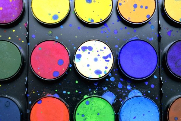
Now, let's dive into the meaning of colors. Here are some of the most common colors and their meanings:
- Red: passion, love, energy, excitement
- Orange: creativity, enthusiasm, warmth
- Yellow: happiness, optimism, positivity
- Green: nature, growth, harmony
- Blue: calmness, trust, stability
- Purple: royalty, luxury, creativity
- Pink: love, sweetness, femininity
- Brown: earthiness, stability, reliability
- Black: sophistication, elegance, power
- White: purity, innocence, simplicity
Of course, these are just generalizations, and the meaning of colors can vary depending on culture, context, and personal experience. As an artist, you have the creative freedom to interpret and use colors in a way that resonates with you and your message.
Now that we've covered the psychology and meaning of colors, let's talk about how to select the right colors for your paintings. The first step is to determine the mood and emotion you want to convey. Do you want your painting to be warm and inviting, or cool and calming? Once you have a general idea, you can start selecting colors that fit that mood.
Another thing to consider is color harmony. Color harmony refers to the pleasing combination of colors in a painting. There are various techniques for achieving color harmony, such as using complementary colors (colors that are opposite on the color wheel) or analogous colors (colors that are next to each other on the color wheel).
When selecting colors, it's also essential to consider the intensity and value of each color. The intensity refers to the brightness or dullness of a color, while the value refers to the lightness or darkness of a color. Using a range of intensities and values can add depth and dimension to your painting.
Lastly, don't be afraid to experiment and play with colors! The beauty of art is that there are no rules, and you have the freedom to create something unique and personal. So, have fun and let your creativity flow!
See ya on Friday!

Article by Melissa
Published 18 Apr 2023